2021 data added to KIPRC interactive dashboard for drug overdose county profiles
After launching the Drug Overdose and Related Comorbidity County Profiles dashboard last year to make Kentucky substance use data more easily accessible to community and health organizations, the Kentucky Injury Prevention and Research Center (KIPRC) has recently updated the dashboard to include 2021 data.
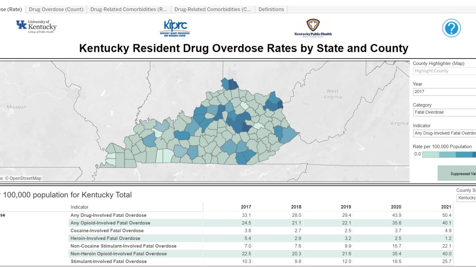
The dashboard includes rates and counts of drug overdoses and selected co-occurring medical conditions for each county in Kentucky (as well as for the state as a whole). It’s designed to be used by all who are interested in learning more about drug overdose in Kentucky and each of the state’s 120 counties.
Dana Quesinberry, principal investigator for surveillance on the Kentucky Overdose Data to Action Program, said the county profiles are an efficient method for KIPRC to provide data from multiple sources in a concise “one-stop” location.
The availability of multiple years of data from multiple sources in one location allows access to information necessary for communities to plan their overdose and substance use prevention activities, added Dr. Quesinberry.
In addition to adding 2021 data, other changes were made to the dashboard based on feedback from partners, said KIPRC epidemiologist Mira Mirzaian, who worked on this year’s updates. While many of the changes are minor, Mirzaian worked on finding a way to differentiate between true zero counts (null values) and values suppressed in accordance with state data use policies, within the map. The goal was to show whether a county had zero overdoses within a specified time period or fewer than 10. (State data management policy dictates that all numbers less than five and rates based on numbers less than 10 must be suppressed to protect patient confidentiality.)
“I think it gives a clearer picture of the burden of drug overdose in counties where the numbers are small,” she said.
Data included on the dashboard are organized into four tabs or pages.
The first tab of the dashboard displays a map of Kentucky, which can be hovered over to focus on a specific county. Those using the dashboard will see rates per 100,000 population of any indicator they are assessing. Additionally, if someone is looking for a specific county, on the right of the map is a drop-down menu where they can select any of Kentucky’s 120 counties. Each map included in the dashboard has the capability to be changed based on the data that the stakeholder is seeking.
“For example, users can specify year, data category, and specific indicator of interest,” Mirzaian said. “In addition to the map of Kentucky, these tabs of the dashboard include the rate by year in table format.”
The second tab of the dashboard includes the same information but as counts instead of rates. The first two tabs of the dashboard feature the categories fatal overdose, nonfatal overdose, and substance use disorder diagnosis. Furthermore, these categories can be further broken down by indicator, which includes drug type, emergency department visits, and inpatient hospitalizations.
The third and fourth tabs represent the morbidity section of the dashboard and include the following categories: drug-exposed inpatient hospitalization births, infectious disease-related emergency department and inpatient hospitalizations, as well as infectious disease-related emergency department and inpatient hospitalizations with a co-occurring drug-related diagnosis. Again, these categories can be further broken down by drug type as well as by infectious disease diagnosis.
The last tab of the dashboard is the definitions page, which includes the International Classification of Diseases, Tenth Revision, Clinical Modification (ICD-10-CM) codes used to define data categories or indicators.
Mirzaian said there are some limitations for the dashboard due to state data release policy. In addition to the suppressed numbers mentioned earlier, rates based on counts less than 20 are considered unstable and dashboard users should take that into consideration when comparing counties.
For those with questions about the dashboard, a question mark icon is featured at the top of each tab. When the user hovers over the icon with their curser, instructions on how to use the dashboard are provided.
Mirzaian said one of the things she appreciates most about the dashboard is how easy it is for users to export data. She said a user can specify their county of interest and scroll down to the export button at the bottom right of the dashboard, which will allow them to output the data as an image, PDF, or PowerPoint slide.
“That, along with the inclusion of a suggested citation, really improves the ‘shareability’ of our data,” she added.
To view the dashboard, visit https://kiprc.uky.edu/programs/overdose-data-action/county-profiles.
For more information on programs or to submit data requests, visit https://kiprc.uky.edu.
KIPRC is a unique partnership between the Kentucky Department for Public Health (DPH) and the University of Kentucky’s College of Public Health. KIPRC serves both as an academic injury prevention research center and as the DPH’s designee or “bona fide agent” for statewide injury prevention and control.